
Lizzie Zelter with HereIn

Specimens of Modern Times, 2023, oil on canvas, 72 x 60 in. Photo: Lile Kvantaliani
[Image description: A close-up view of a glass storefront. Rendered in many rich colors, the topsy-turvy image exerts a destabilizing force on the viewer.]
Lizzie Zelter’s paintings skillfully employ surprising shifts in scale and perspective to deconstruct our relationship to the spaces that surround us. She spoke with HereIn Editor Elizabeth Rooklidge about her work’s evolution over the last few years and about the questions that currently drive her practice.
HereIn: Looking through your work from the last few years, I noticed that back in, say, 2020, your paintings were more oriented toward realism, although they definitely have a certain wobbliness underlying their aesthetic. Now your work plays with representation in more outrightly perplexing ways. I’m curious as to how that shift came about.
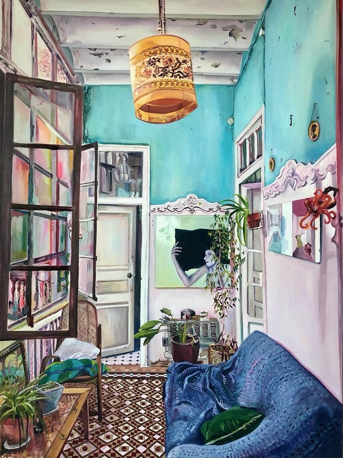
La Sala de Todos, 2020, oil on canvas, 48 x 36 in.
[Image description: A narrow living room with a tall ceiling and large, paned windows to the left. The peeling white and blue paint, many potted plants, and soft-looking sofa give the space a romantic air.]
Lizzie Zelter: I came to painting from a natural place. I really liked it in high school and college, but I wasn't studying it formally. After college, when I was starting to paint more seriously, it was such a thrill—truly a thrill—to represent something and see it in a painting I had made. It was a shock to me that this could happen. As that immediate shock passed and gave way to the questions I'm interested in, I began to leave more to be discovered, not filling in all the answers. The places and things I painted were filled with mystery to me, so I didn't want them to feel like they were directly from reality and made sense. Leaving some things open and emphasizing what is perplexing about my subject matter has felt more true to me.

The Twister, 2023, oil on canvas, 72 x 60 in. Photo: Lile Kvantaliani
[Image description: A view from below of many objects—brightly colored flags, chandeliers, and all manner of bric-a-brac—hanging from a grid on a white ceiling. One banner stands out—it features two feet in blue socks and red shoes, and says “…no place like home.”]
HereIn: Tell me more about those questions you’re interested in.
Zelter: I'm most interested in how we are always actively producing space. In a very micro sense, even just a bedside table—what we put around us, making domestic space and filling it with things from our culture and our time and our interests. But then those things reinforce our identity, as well. That reciprocal process is so omnipresent and natural that it can be hard to see. Maybe it’s easier to perceive it on a micro scale, but it’s operating on a macro scale, in the form of laws and institutional actors. It feels like in the last few years there’s been a larger national discussion around how fabricated and human-made the structures around us are. To me, the awareness that we are participants in legal, cultural and architectural norms and have some level of control is empowering. I like to draw attention to small acts of change, interventions that humans make in their homes or cities. I look for moments of personal flair, someone adding flags or fencing to their porch or arranging their belongings in an unusual way. I try to emphasize these irregularities, the moments where things feel familiar but something is unsettled and slightly strange. I hope that by disrupting immediate recognition of the world around us my work will push for a new way of looking at and understanding our relationship with our surroundings.

Burning Bush, 2023, oil on canvas, 50 x 30 in. Photo: Lile Kvantaliani
[Image description: A skinny, bare tree stands on an urban sidewalk. It is encircled by chicken wire, from which hangs many small, colorful flags.]
HereIn: I’m particularly struck by your use of color. It can be almost shockingly vibrant, like with the pinks and oranges you sometimes use. Will you tell me about your color choices?
Zelter: Color is maybe what I love most about painting as a medium. It’s so direct, so immediate, for me as both a maker and a viewer. Out in the world and working in the studio, I pay close attention to the way certain colors respond when they are placed alongside one another, how strong or weak they are, what kind of material they imply. Do they seem thick and plasticky or translucent and soft? I think that’s what draws someone in as a viewer.
I’ve been trying to be more strategic about how to harness the power of color. I’m thinking more about each painting as an individual thing or world unto itself and have been trying to push myself to consider the mood or feel of that entity to make it as strong or puzzling or comforting as it needs to be. But there are some other interesting things with color—how it exists in a larger social orbit. We put a lot onto color. At the beginning of grad school I was using tons of pinks and light purples and there was something maybe girly or feminine or happy associated with those impulses. That really interests me as a trope. The idea that something that is culturally coded in one way can’t also be its opposite. For a bit I fell into that trap, and saw my own work as too sweet and light and felt embarrassed because I wanted it to be understood as serious, or at least trying to deal with serious things. Now I’m less self-conscious. I know that my work can be multilayered and at times even paradoxical. There’s a surface level and there’s also something deeper that fights against the surface. The friction in that relationship has a lot of potential. I’ve also grown to respect what darks and neutrals can do, especially when in close proximity to pastels and neons. They make them pop and almost make them stronger, by showing that a little can go a long way.
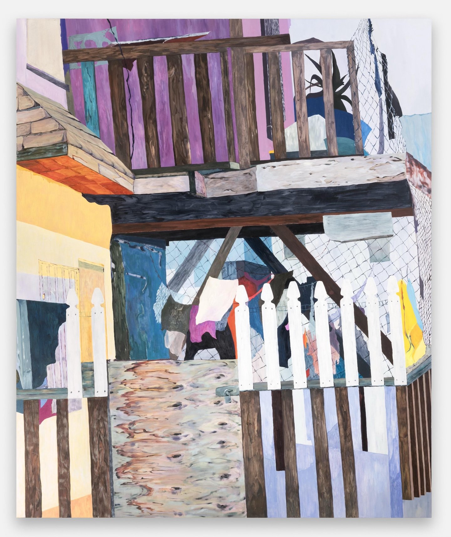
Funk Americana, 2023, oil on canvas, 72 x 60 in. Photo: Daniel Lang
[Image description: A pleasantly jumbled amalgamation of architectural forms, which together give the sense of a two-story building surrounded by wooden and wire fencing. We see utility boxes, hanging laundry, and a potted plant.]
HereIn: Absolutely. I love that. You know, looking at certain works—such as Specimens of Modern Times and Funk Americana—the way you use space and composition is befuddling in the best way. I’m curious about the process that leads to that dynamic. Are you working from photos?
Zelter: I have quite different processes for the various sizes of paintings I make. For this larger scale I work in, 72 x 60 inches, I typically start with a photograph of a real place I’ve been. There had to have been something specific to catch my eye, particularly alluring or weird to serve as a hook. I take a lot of photos on my phone, walking around, sitting in the studio or at home. Out in the world, I am drawn to funny architectural moments, layered geometric patterns, and reflections. I make folders on my phone and computer and group images based on certain throughlines: a type of pattern, a certain perspective, a type of setting such as airports, bathrooms, or dollar stores, specific materials like glass or textiles, families of objects such as light fixtures or office supplies. I edit and crop the collected images, often printing them out and cutting them to find a compelling composition. That's something I've learned a lot in the last few years—how to translate photography into painting.
It’s important to me that these paintings begin as grounded in a real geography, and that I personally witnessed them. There is an appeal to the randomness of crossing paths with a certain place, seeing it from a certain position at a certain time of day. But then, as the painting process begins, it’s equally important that it takes on a life of its own and becomes fictionalized. That is necessary to emphasize that they are representations, translations, indirect copies that can only mimic. In the two paintings you mentioned, I added imagined elements to complicate the original architectural reference, introduced new color relationships, and played with various paint application styles that all together enhance what appears to be a perplexing scene.
I'm very intrigued by the relationship between flatness and fakeness. I got quite interested in storefronts and commercial window displays for this reason. They are explicitly sites of presentation, where someone arranged elements to showcase the artifacts of our time. There is something deeply authentic and totally superficial about the storefront. I also like the duality, the doubling that can happen with glass as a material and with the barrier between inside and outside. The storefront window lets us see through it, but prevents total access. With certain light, a reflection of the outside world is superimposed onto the interior space, presenting two visual fields at once. I am interested in these moments of optical illusion for their power to make us question our gaze and our world.
[This conversation has been edited by HereIn and the artist for length and clarity.]